Designing a Promotional Marketing Website for a Digital Agency
Project Summary
Client
Usability Matters have been leaders in the field of user experience design and research for 15 years. They needed the company promotional website to reflect their organization's maturity and leadership in the UX industry in Toronto.
Core Design Team
- Steven LeMay Design Director
- Adie Margineanu UX & Visual Designer
- Andrew Emond Front-End Developer
Core Client Team
- Sarah English Director
- Ania Sedgwick Marketing & Sales Director
- Louise McCulloch Marketing Coordinator
Activities
- Requirements Gathering
- Experience Strategy
- Wireframing
- Visual Design
01
Project-Specific Goals
The primary goal of this project was to re-design the Usability Matters promotional website to reflect the agency's expertise, wealth of experience, and leadership in user experience design research, strategy, and design.
02
Understanding the Problem Space
The sales and marketing department put together personas for the users we are targeting - digital decision makers and UX professionals - based on their own primary research consisting of interviews and sales calls.
I put together a UX strategy brief to make sure our design vision was not compromised at any stage of the design process.
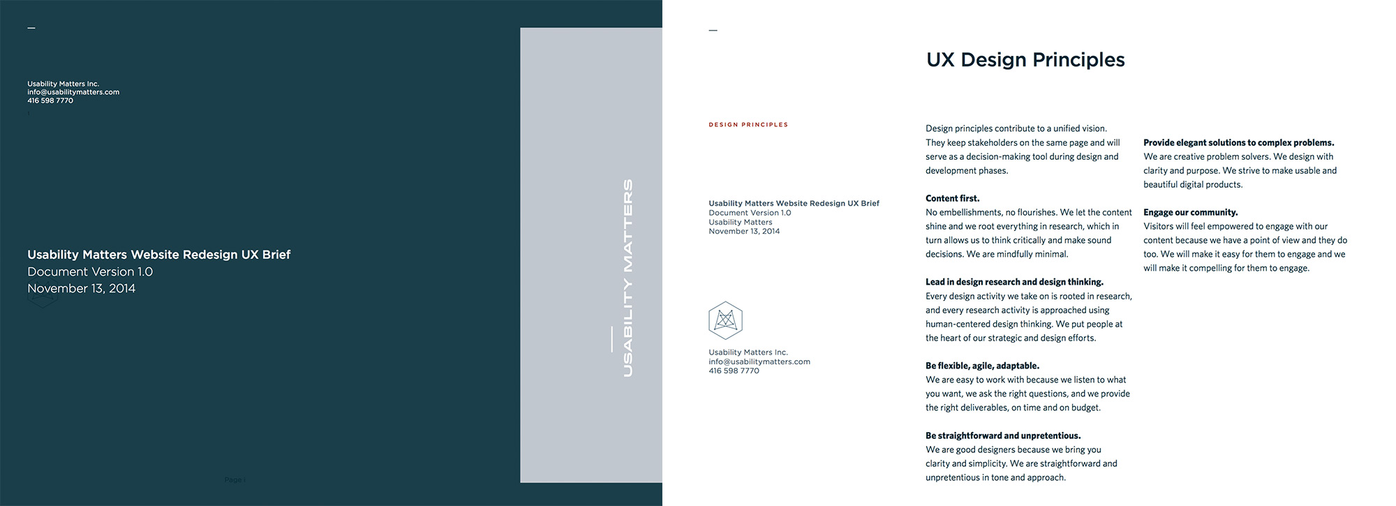
Figure 2.1
The UX strategy brief document, showcasing our design tenets.
03
The Design Process
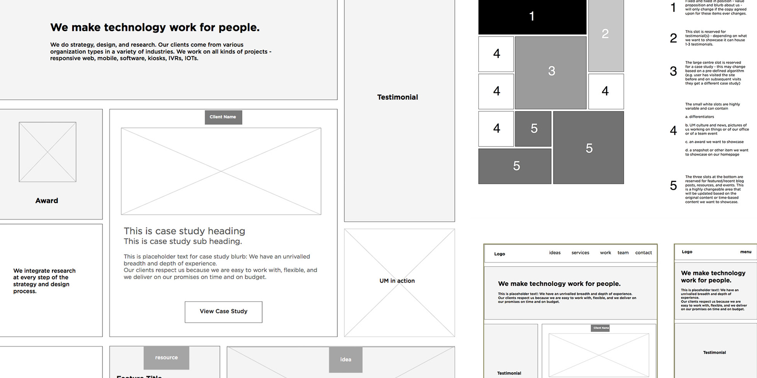
Once the design brief was approved, I wireframed the different pages outlined in the brief, at three different responsive breakpoints.
These wireframes were all about creating templates that could be leveraged for consistency and in case the site needed to be expanded at any point with minimal added design work. Some of the pages - like the home page - needed a legend to provide more flexibility about each content module's use.
Once the wireframes were approved, I mocked up two different creative concepts for the look and feel of the home page.
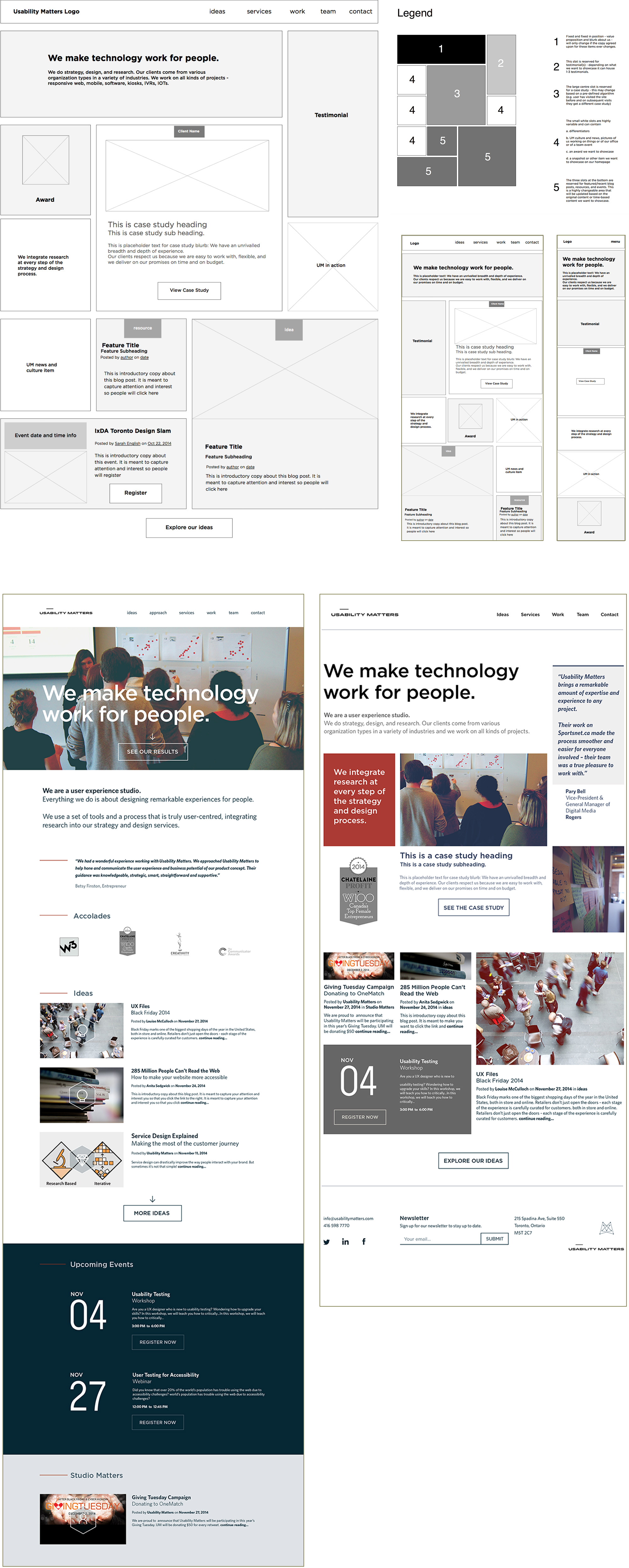
Figure 3.1
Wireframes for the home page at large, medium, and small screen responsive breakpoints. Two visual design concepts for the home page.
I also created a distinctive and unique icon set to be used on the website and in branded material.
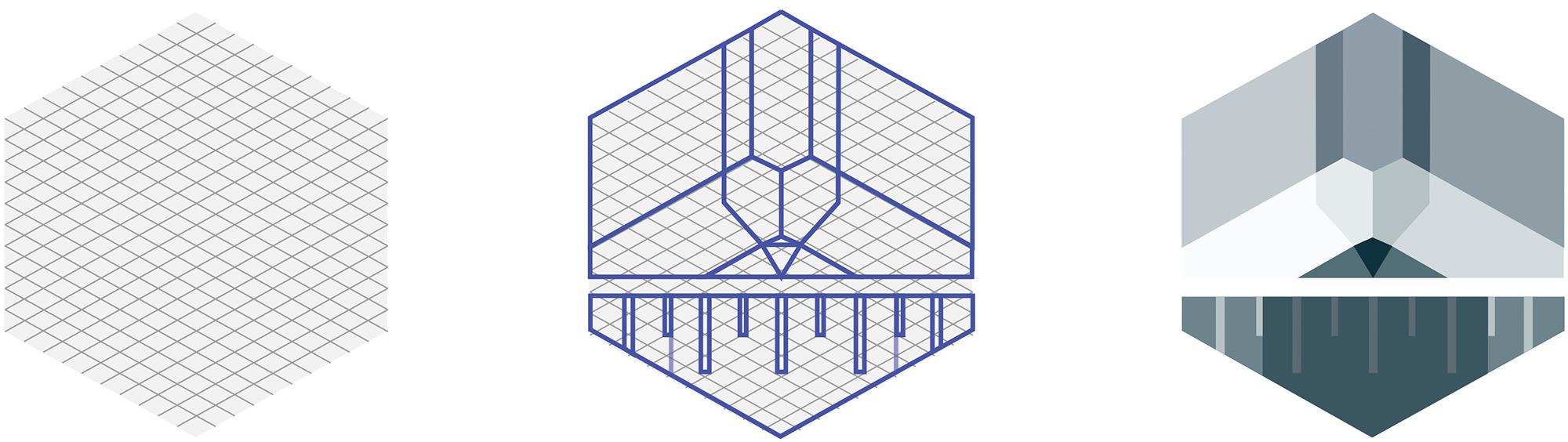
Figure 3.2
Grid system I designed for the icon set and progress from draft to finalized "Design" icon.
I wanted to showcase a unique, geometric style with interesting but precise angles. The final icon set has been used in pitch decks, presentations, printed materials, and in updated mockups of the website.
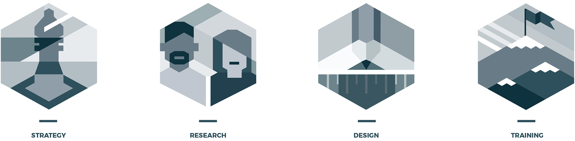
Figure 3.3
Final Services Icon set for use on the Usability Matters website and in branded materials.
04
Design Evolution
At the beginning of 2017, the services page of the website was iterated on and improved, using the patterns and visual design direction of the 2015 redesign.
Based on research and competitive landscape review by the marketing team, they concluded that the page simply was not showcasing the agency's services and the impact these services deliver to clients.
The new design takes a progressive disclosure approach, first surfacing a high level introductory page on all service areas, with the option to dive into a specific service area (e.g. UX/UI Design) and find out how these services have quantitatively and qualitatively helped UM's clients. The page has information about the deliverables and activities conducted in that service area as well as related content like case studies and blog posts to really showcase the team's expertise.
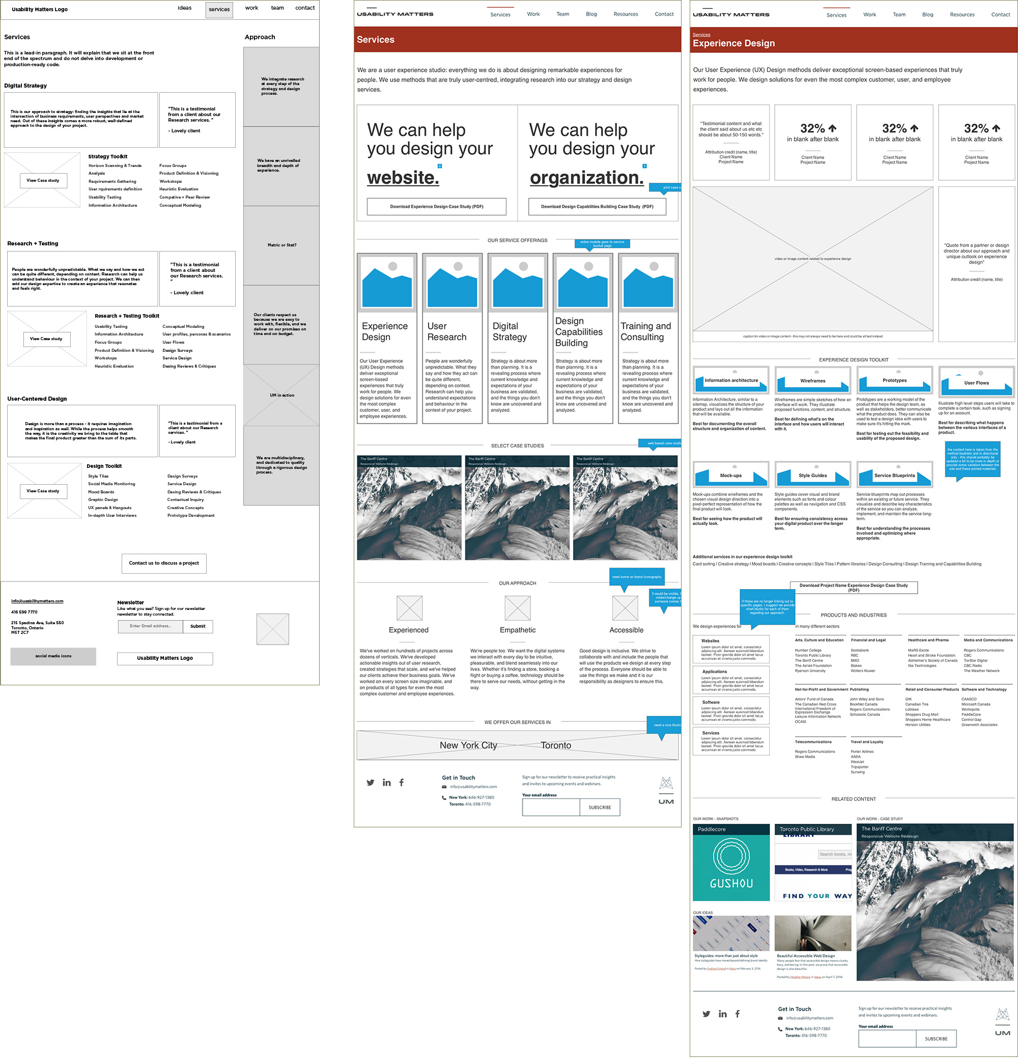
Figure 4.1
Original wireframe of the services page (left) and the new iteration of the services landing page (middle) along with a net new page, a service area page going into detail about our specific offerings for that service area (right).
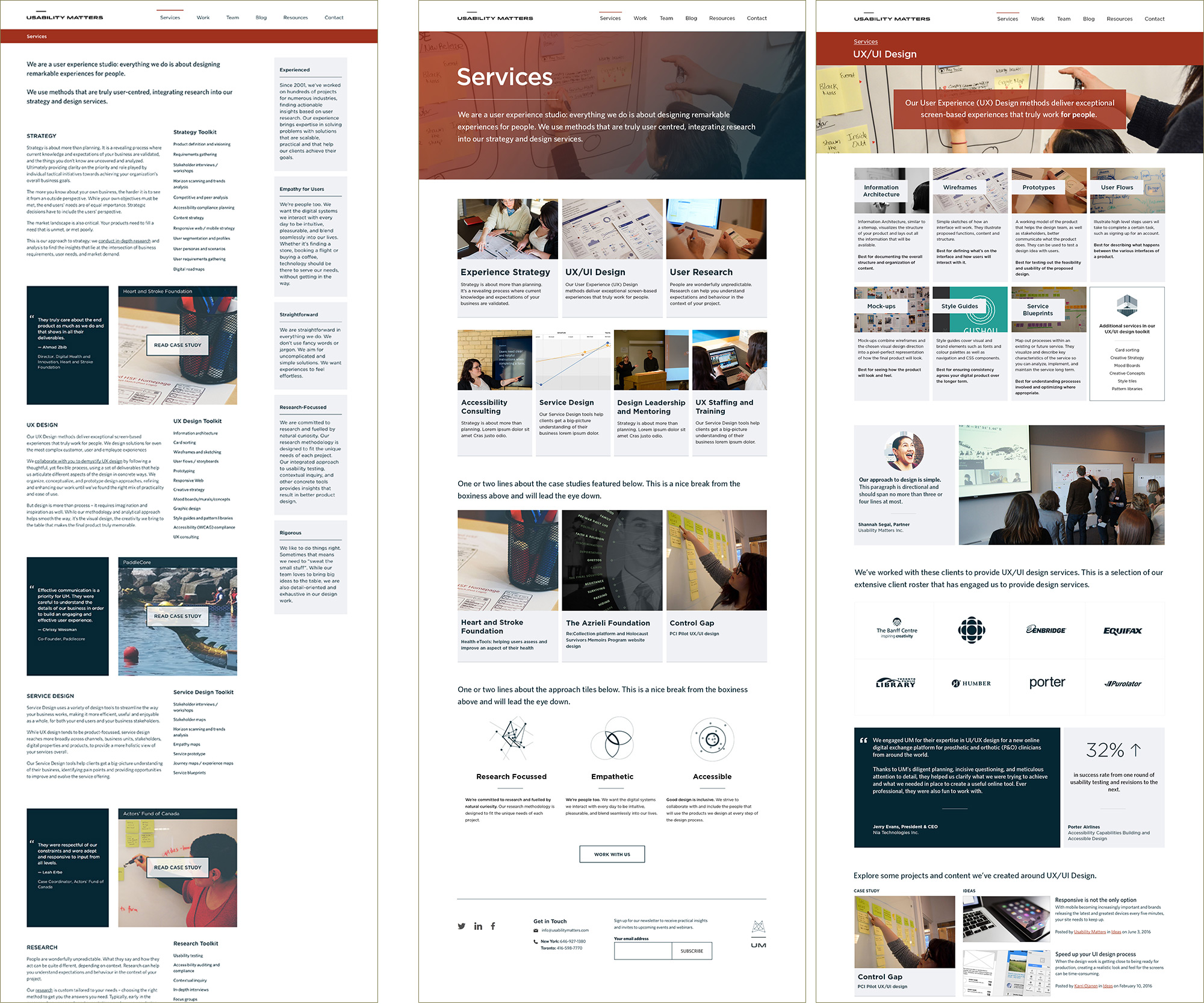
Figure 4.2
Visual design for the original services page (left) along with the newly designed page (middle) and the services area sub-page containing more detailed information about activities and deliverables (right).
05
Learnings
- AA content-first approach is vital for an organizational website.
We tried to promote and advocate for a content first approach because imagery, written content, and video are so important in showcasing what a digital agency can do and the design of the website itself should be unobtrusive.
06
Impact
The Usability Matters website showcases the many years of experience and expertise the organization holds.
The updated services page is under development. To explore the live website go to www.usabilitymatters.com