Five Guiding Principles for Common Design Challenges
As a UX practitioner, I consistently strive to design for a responsive, fluid, and accessible web. This means that content is optimized for every possible viewport and the design is usable by as many people as possible in as many contexts as possible.
This can be a relatively easy task when it comes to static-content websites like informational or marketing initiatives. But sometimes content is rich, interactive, or requires a complex presentation to preserve its meaning.
Whether it’s a complex navigation system, a data table, or a web form, here are five guiding principles to ensure your designs will work on any device, at any time, for any user.
Principle One
Decide on a Grid System and Respect It
Grids are a designer’s best friend. They provide visual organization and hierarchy, both key ingredients in creating simple, clear, and scalable digital experiences. Whether you’re putting together a static comp, or designing in the browser, the grid system you utilize is the structure or the bones of your design. There are some wonderful resources for easily incorporating grids into your design planning, without having to bust out a calculator and graph paper.
The modular grid pattern web app allows you to specify column number, width, and baseline width and spits out a Photoshop pattern that you can place in the background of your files. I use it every time I start a new visual design project. Bootstrap, a CSS framework that allows you to quickly and easily build responsive sites provides a code-based grid system. And of course, other web grid systems abound, with accompanying reference material if you’re looking for an independent, crash-course study of grids in graphic design.
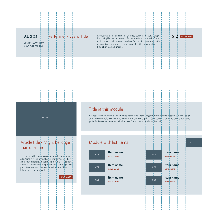
Figure 1.1
An 18-column grid in use. Notice how the grid is being adhered to across different pages.
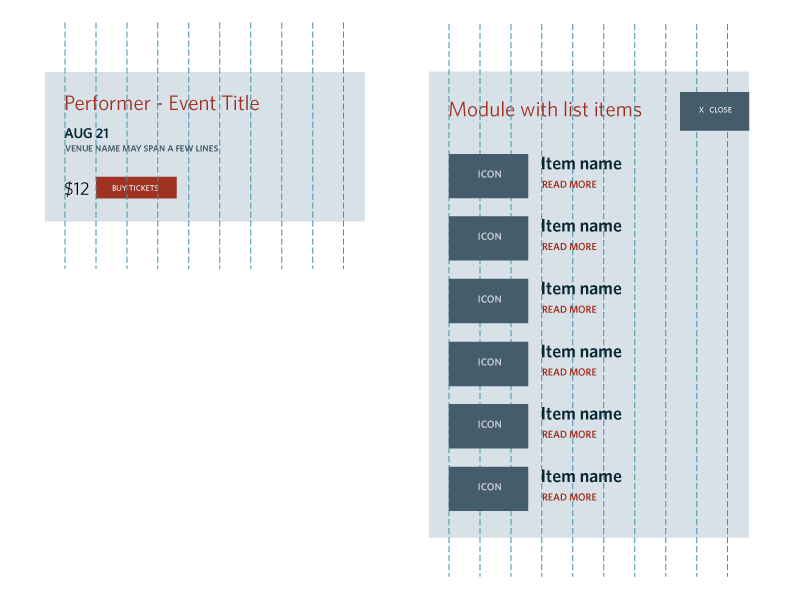
Figure 1.2
The 18-column grid is pared down to a 9-column grid for a mobile layout.
Principle Two
Prioritize Information
Different types of information are important in certain contexts. This is not so much a question of what device is being used because I know you’re all shopping and banking and doing your taxes on your phones. I don’t think complicated processes should be suppressed on small screens, rather, they should be re-prioritized to take full advantage of the constraints imposed by a small screen.
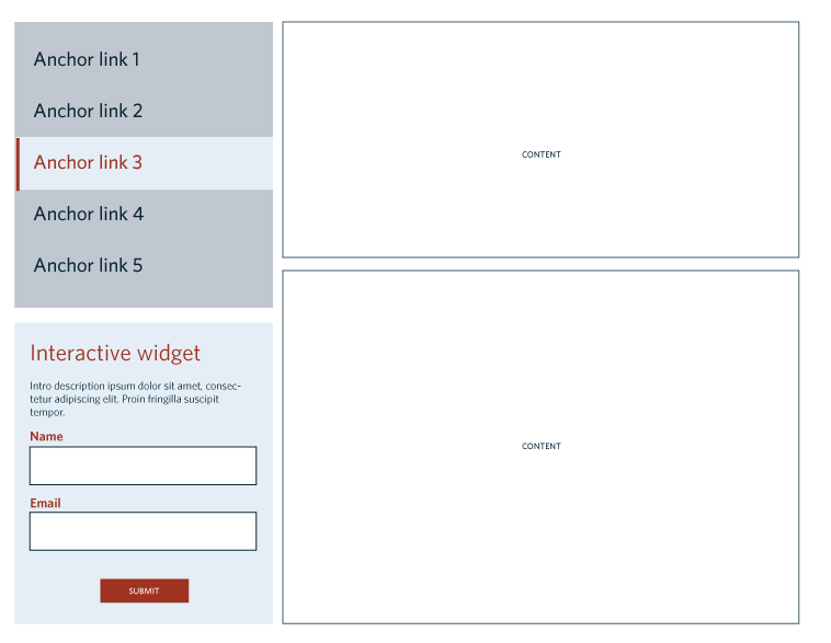
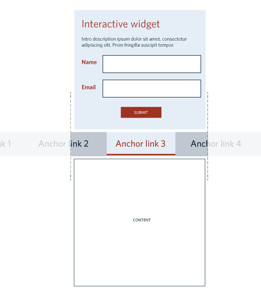
Figure 1.3
A form is moved from a fixed position in the left column of the site, to the top of the page on a small screen. It was decided during the planning stage that if someone is coming to this page, the most common action they take is to fill out this form rather than peruse the rest of the content. Considering user needs in concert with screen real estate can be very important.
Tables and charts can be difficult on the web. Deciding how to optimize them for any screen size depends on the purpose and importance of the information. Some tables are layout tables, meaning the information can easily be linearized without losing meaning.
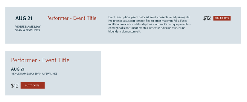
Figure 1.4
An example of a layout table that organizes event information. In the small version, information can be re-prioritized or suppressed without losing meaning. This is at the discretion of the designers and content strategists.
Data tables contain information organized in a grid where each cell corresponds to one or more column header and one or more row header. This kind of information is difficult to pare down or linearize without losing meaning. It is also the kind of information that gains some of its value from easy comparison between cells in different rows or columns. That is the biggest challenge of streamlining data tables for small screens.
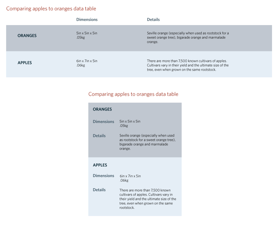
Figure 1.5
An adaptation of Brad Frost’s responsive table layout that attempts to provide the same information regardless of viewport size. The biggest sacrifice is easy scanning between rows to see how items compare.
Principle Three
Curate a Small Set of Responsive Design Patterns and Use Them Consistently
Thanks to the pioneering efforts of web strategists like Brad Frost and Luke Wroblewski, there are robust libraries of responsive design patterns available online. The most difficult part is being selective and consistent in the types of patterns we use.
Consider how the patterns you choose will seamlessly take a user from a large screen to a small screen experience. Is the user comfortably able to open a hamburger menu from a mobile device? Does the user understand what an icon means without the aid of a label? Is the user able to find what she wants without confusion or error?
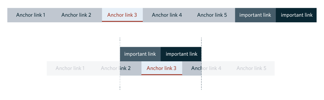
Figure 1.6
Here is a responsive pattern example called Off Canvas, to display a set of in-page anchor links. The user can scroll left or right through the anchor link menu to decide which part of the page she wants to navigate to.
Regardless of the responsive patterns you choose, it’s important to consider if they can be applied to global or repeating elements/portions of the website and if they provide elegant solutions to the navigation and layout challenges of small screens. By minimizing the responsive patterns you use, you will create a more coherent, consistent, and readily familiar experience.
Principle Four
Modularize
Atomic design addresses the fundamental challenge of the responsive web. By breaking down web pages into re-useable, re-configurable components, we can move from designing discrete pages, to designing a flexible system.
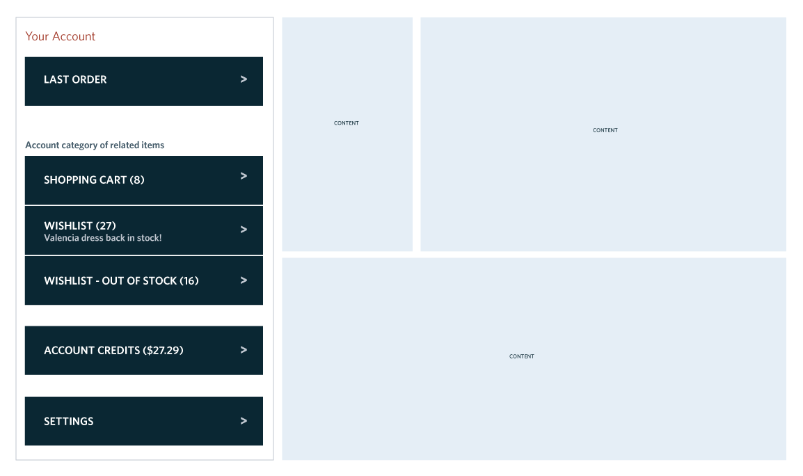
Figure 1.7
In this example, a personal account module can easily fit into a small screen layout or be incorporated as part of a larger page template.
The larger page template can be optimized for any viewport using a responsive layout design pattern.
Principle Five
Consider Accessibility Along the Way
Accessibility is a crucial component of design. As you design sophisticated or complicated page layouts or informational charts, take a moment to consider if your design is helping or hindering access. Does the design have a clear hierarchy and structure? Can the content easily go from columns and tables to a linearized audio format available to assistive technology without losing meaning? Are there bells and whistles that obfuscate rather than provide clarity and meaning?
For design to be compelling, it needs to be understandable. Design is not about visuals, it is about information delivery and how well this is executed for any and all end users. Don’t forget about this when you start planning your next web project, because it is much harder to retrofit for accessibility than it is to consider it from the beginning!