Integrating Accessibility into Established Digital Workflows
Project Summary
Client
The client is a mid-sized Canadian airline with service across Canada and into the United States. They place a lot of importance on personalized customer service and a very friendly, cohesive brand. Full digital accessibility was the natural next step.
Core Design Team
- Terry Costantino Design Director
- Adie Margineanu User Experience Designer
- Steven LeMay User Experience Designer
- Heather Moore User Experience & Visual Designer
Activities
- Accessibility Audit
- Accessibility Training
- Accessibility Quality Assurance (QA)
- Agile Sprint Deliverables
- Wireframing
- Prototyping
- Design Mentorship
- Visual Design
01
Project-Specific Goals
All airlines with service into the United States are mandated by the Department of Transportation (DOT) to make their digital offerings accessible by complying with Web Content Accessibility Guidelines (WCAG) 2.0 Level AA. Specifically, our client’s core transactional and loyalty pages needed to be WCAG 2.0 AA compliant by December 2015, with the remainder of their digital offerings made accessible by December 2016.
The goals of our engagement with the airline were four-fold:
- AIdentify and catalogue all the barriers to access and areas of noncompliance with WCAG 2.0.
- BTrain and support developers and marketing team members as they worked to address the development- and content-specific accessibility issues.
- CProvide accessible design revisions to core flows that can be leveraged across the site to non-transactional pages and that maintain the integrity, style, and intent of existing brand guidelines.
- DConduct several rounds of accessibility testing as design and development changes are implemented and iterate based on findings to improve overall experience.
02
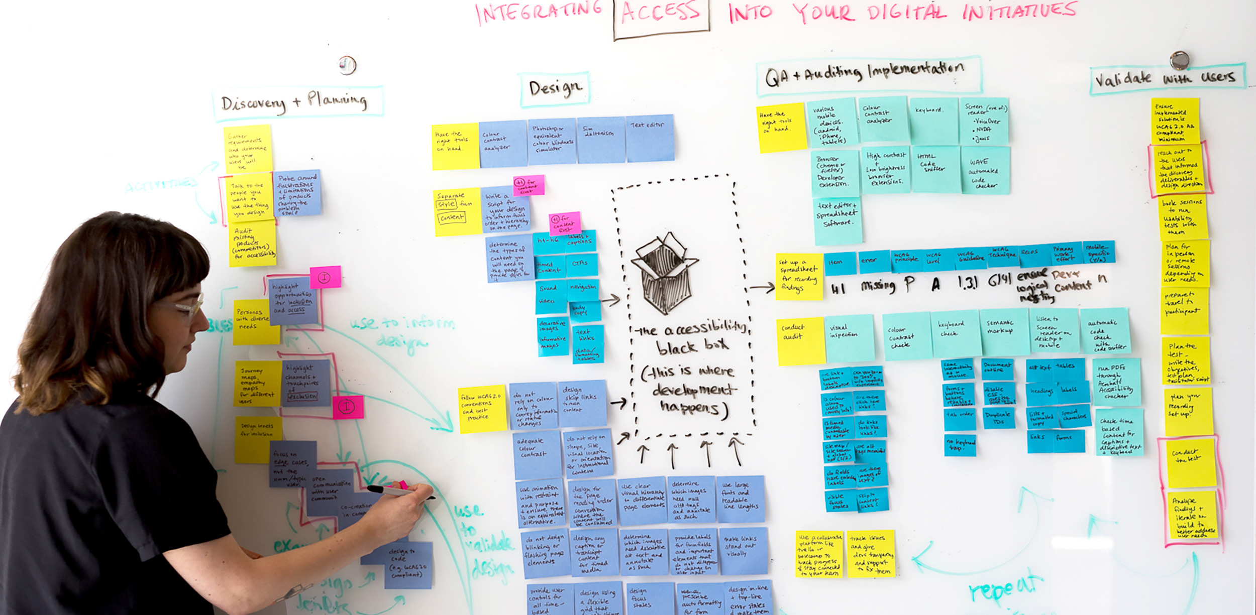
Understanding the Problem Space and Barriers to Access
We conducted a comprehensive accessibility audit of 30 discrete pages, focussing on core transactional and loyalty pages. The report we delivered prioritized severity of the problems based on the legislative deadlines the airline needed to meet as well as categorized by the type of work effort involved (e.g. design vs development vs content).
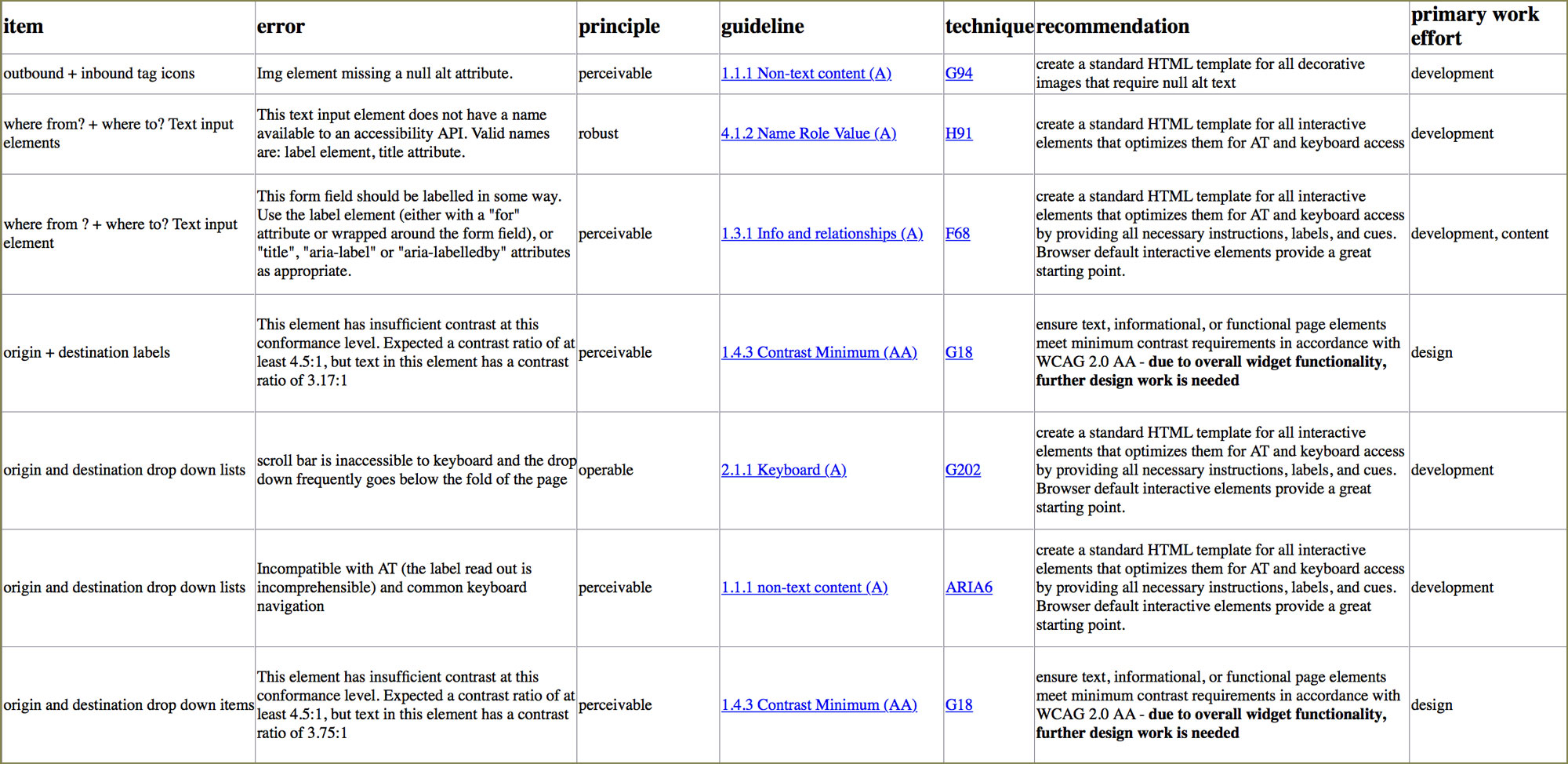
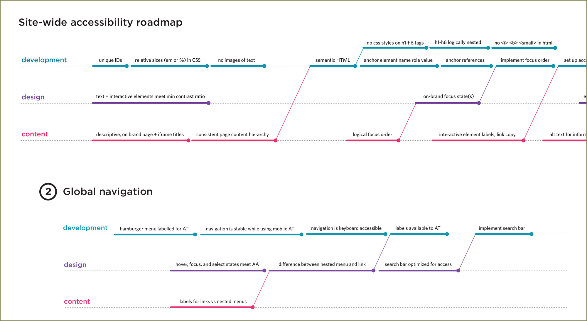
Figure 2.1
Raw results from the accessibility audit (which included a manual inspection, keyboard check, colour contrast check, screen reader check and automatic code check) analyzed and organized into meaningful data, including error type, recommendations, WCAG recommended techniques and work effort involved.
This data was summarized in an interim report and provided as an appendix in the final accessibility report.
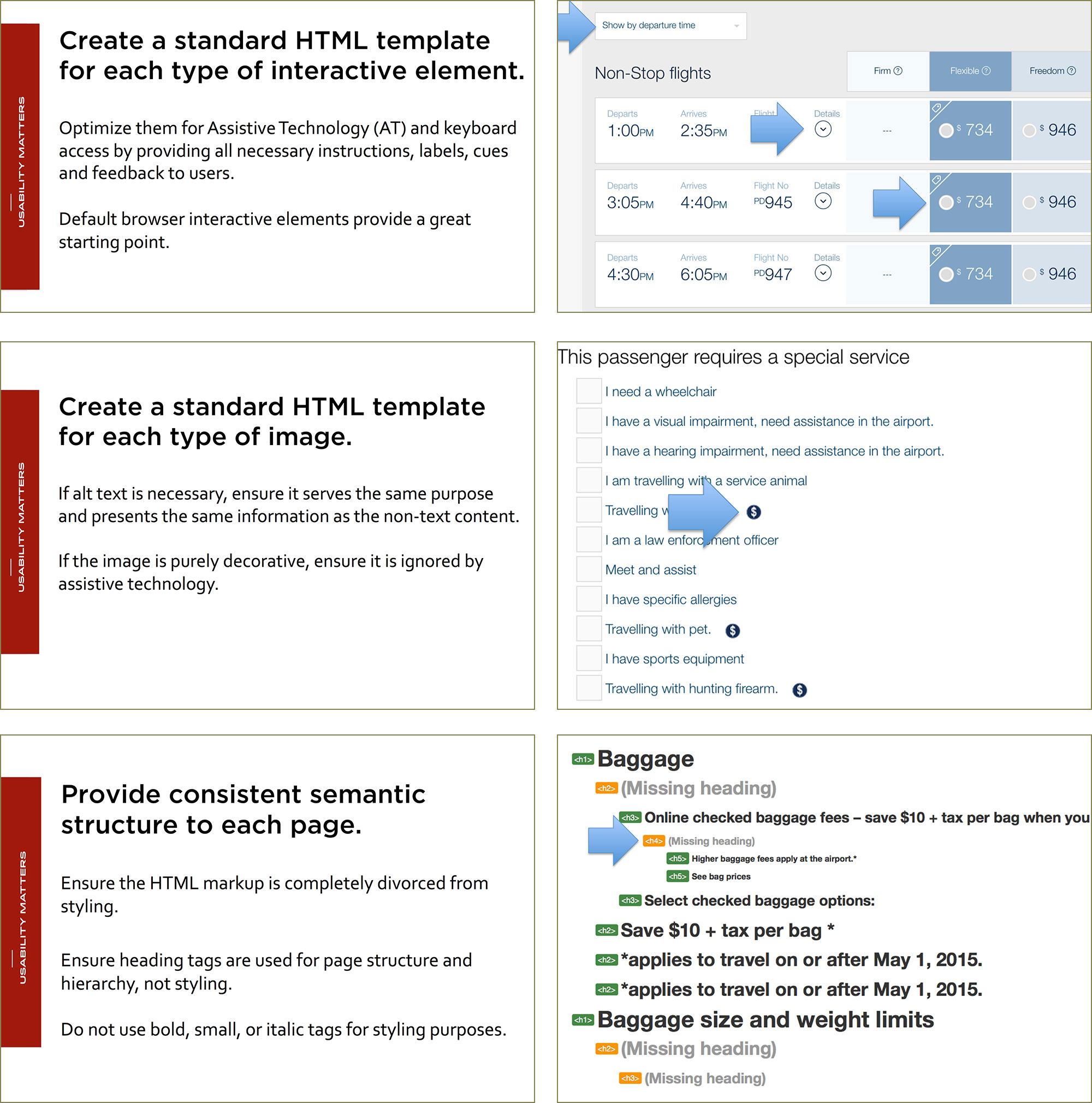
Figure 2.2
A selection of recommendations from the interim report, highlighting non-compliance instances on website screenshots.
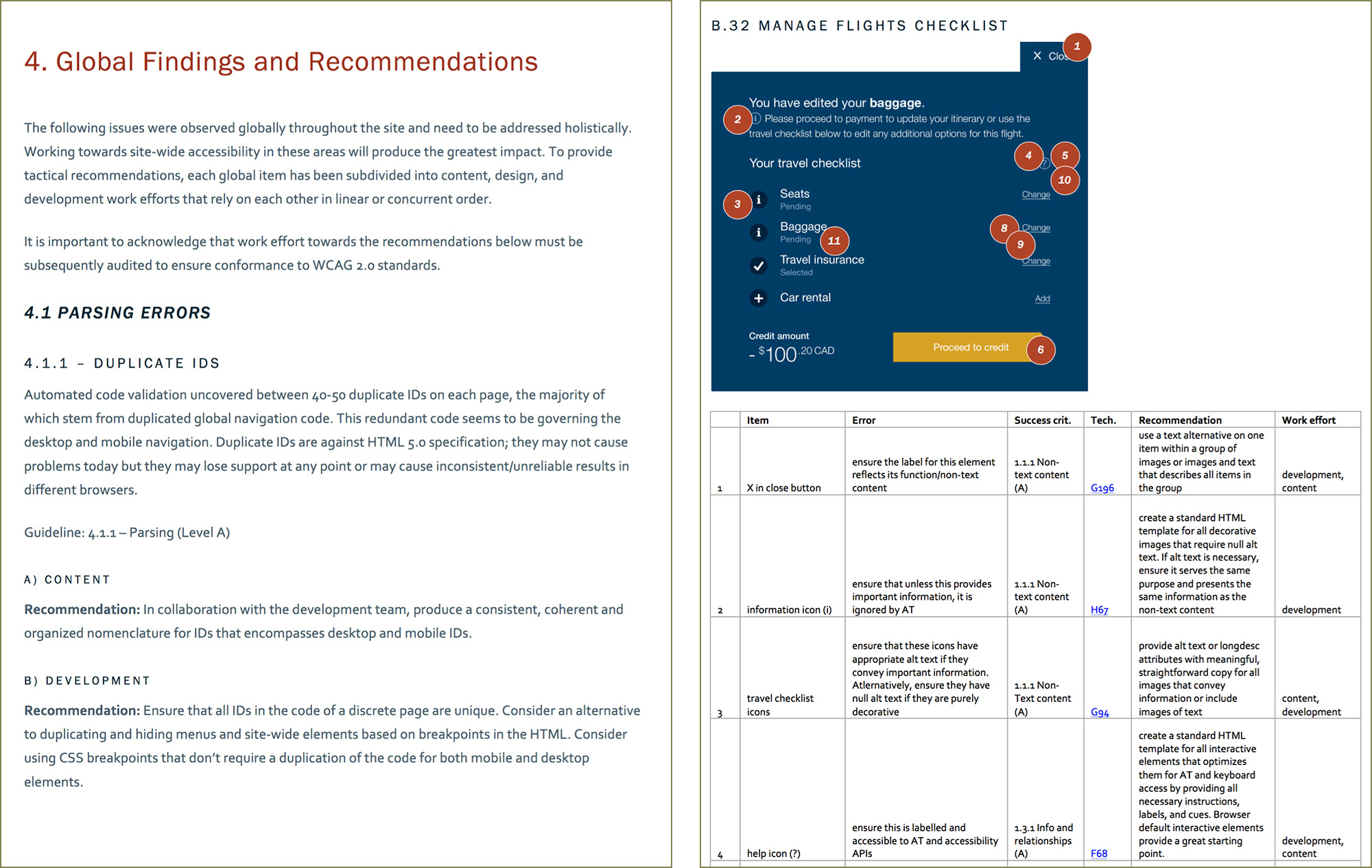
Figure 2.3
The final accessiblity report spanned 172 pages of global findings and page level findings and recommendations, along with a generalized accessibility roadmap for the site and specific components such as global navigation and page templates.
In order to improve efficiency and designate work effort, each recommendation and issue was always mapped to a role (development vs design vs content).
03
Mentorship
We delivered accessibility workshops to the development team, at first focussing on the specific issues encountered during the audit, then broadening it to a general Accessibility for Development session.
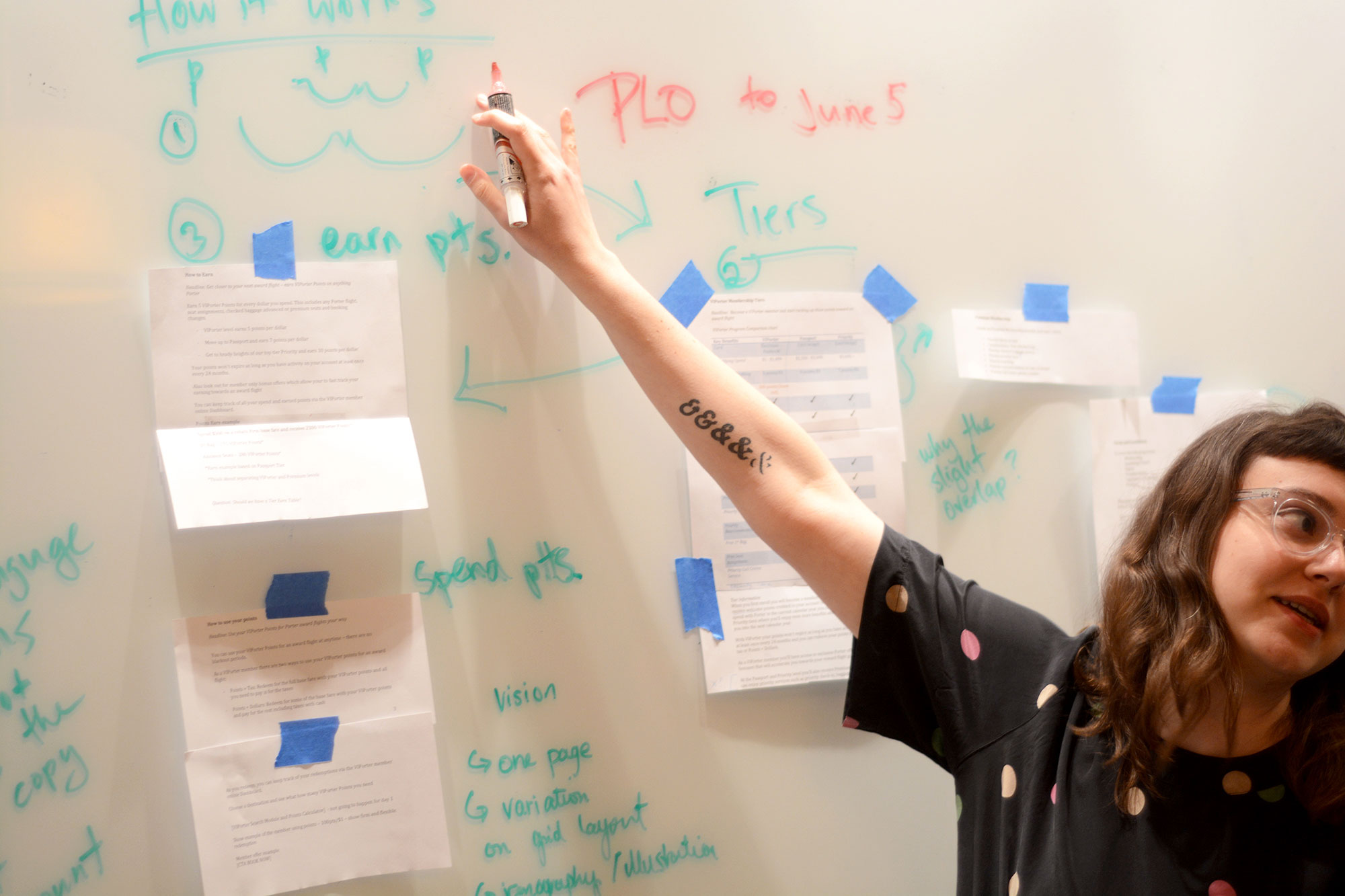
Figure 3.1
Brainstorming session about improving the airline’s loyalty program design and functionality.
I worked from the client’s offices several days a week, embedding myself into the development team to answer questions, provide feedback and direction, and to facilitate brainstorming sessions with the client working team as needed.
04
The Design Process and Quality Assurance
The client did not want to depart from their brand, so the design work we did needed to consist of small improvements and refinement rather than re-invention. We continued using their brand colours and page layout constraints, but ensured all informational content met WCAG 2.0 AA colour contrast and all labels were unique/informative.
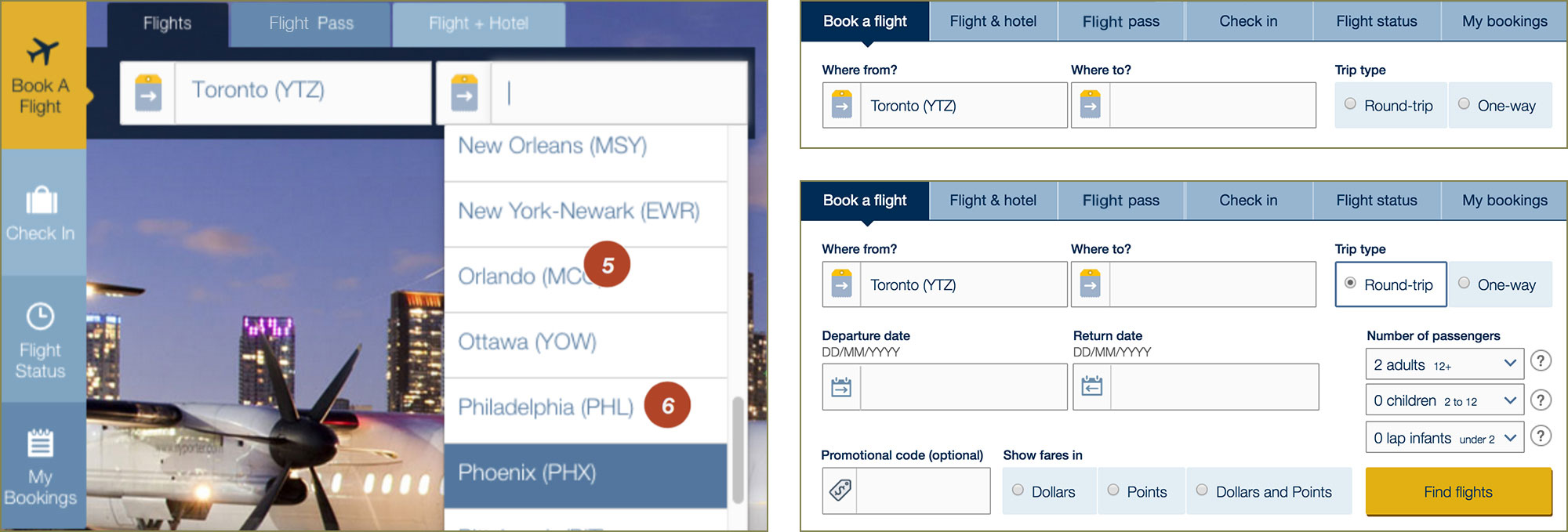
Figure 4.1
The airline’s booking widget before (left) and after (right) accessibility considerations were incorporated into the design.
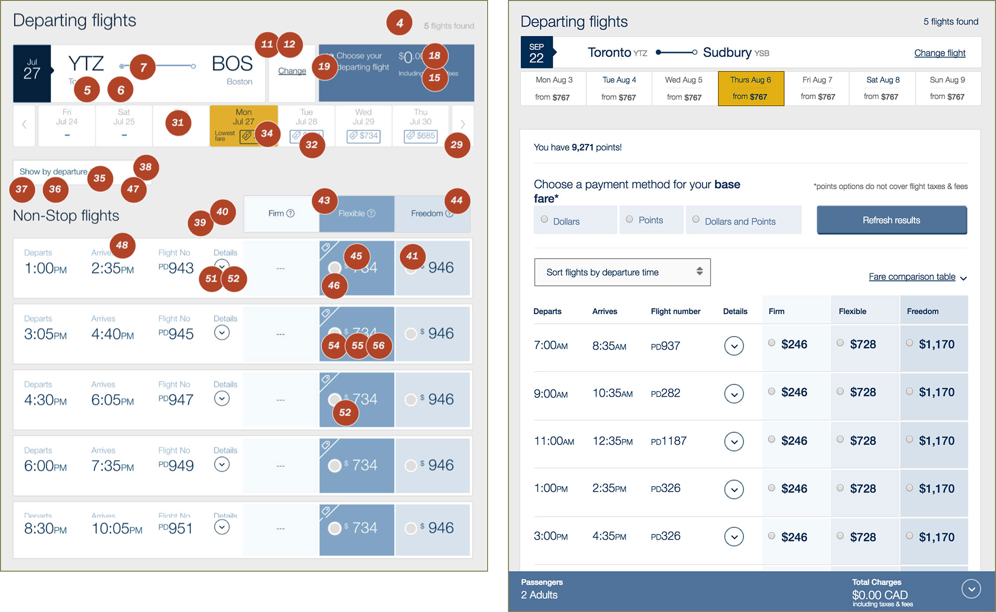
Figure 4.2
The airline’s flight search results page before (left) and after (right) accessibility considerations were incorporated into the design.
We annotated the designs with robust specifications for accessible interactivity. Focus management, focus order, content hierarchy, seat selection mechanics, and global navigation considerations required a concerted effort on the design and development fronts to be made accessible.
The brunt of the development effort was managed in Jira. I QA-ed all tickets tagged with “accessibility”, did micro-audits, and provided additional feedback for any outstanding accessibility issues.
05
Evaluative Research and Design Iteration
Several core transactional flows on the website were tested with participants with disabilities before the accessibility work was complete. The findings from this testing uncovered barriers to access that the initial audit did not catch and helped us prioritize design revisions to truly work for people with disabilities.
Choosing a seat was particularly difficult and we observed a very high fail/abandon rate for the booking a flight task on this page. Seats were not labelled adequately and keyboard focus, although WCAG 2.0 AA compliant, did not meet the needs of our testing participants.
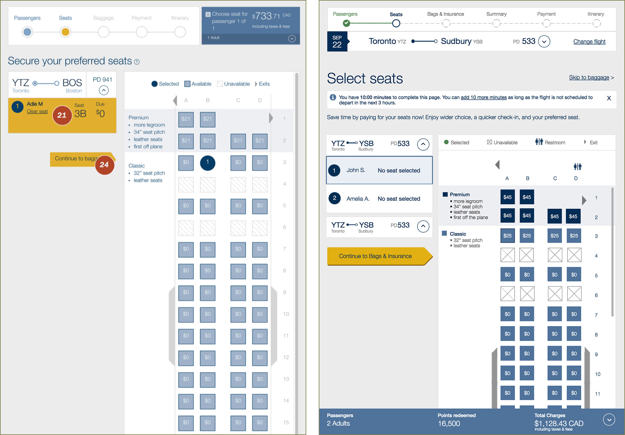
Figure 5.1
On the left is the airline’s seat selection design before we came in to improve site accessibility. On the right is our initial seat selection design, in keeping with the airline’s branding and tone, with more accessible colours, labels, progress bar, and page structure.
We provided more detailed labels for seats to allow for speech recognition to target an individual seat. We worked with the developers to provide clearer and more consistent keyboard control and focus order so users could move between selecting the passenger and selecting their seat without having to move through the entire seating map each time.
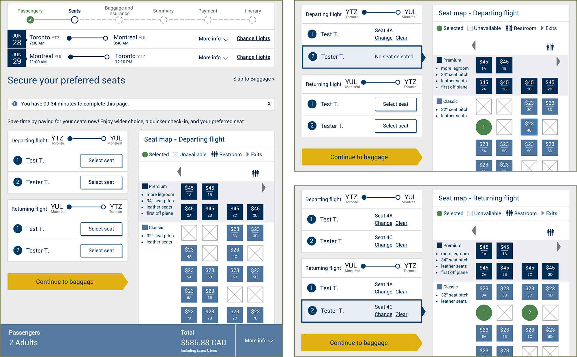
Figure 5.2
Changes to the seat selection page based on usability testing with people with disabilities.
During subsequent testing rounds, we observed a drastic improvement in success rate and very positive feedback from participants.
06
Learnings
- AIntegration with the implementation team is vital for success during an accessibility initiative.
The design work and development work are inextricably tied in creating an accessible experience and the two need to reinforce each other. Waterfall methods simply do not work and create needless work for the designer having to very specifically and precisely annotate flows and visual designs. Showing and explaining the same thing to the developer in a fraction of the time has the added benefit of creating shared understanding and empathy.
- BThe proof is in the testing.
We came into this organization on the heels of an agency that had told our client they only needed to be WCAG 2.0 A compliant and that improving colour contrast would ruin their brand. Once the legislative mandates came in and we helped our client create an accessible experience, they truly became accessibility evangelists when they saw the impact it has on real people that need to use their services. The drastic improvement and the positive feedback from participants along with our relentless support to the development and content teams, has made our client an accessibility champion.
07
Impact
Highlight
26% increase in success rate during the second round of accessibility testing
Once the results of the audit were implemented and the site design was revised to be more accessible, we saw a drastic improvement in usability and feedback from participants.
- "The descriptions of the form fields were well written, as were the titles and links of the web pages.
- User with mobility impairment and low vision (Screen reader, braille display)
- "The sections are marked and broken down nicely.
- User with visual impairment (Screen reader, braille display, keyboard only)
- "Totally accessible.
- User with visual impairment (Screen reader, speech recognition, specialized stylesheet, keyboard only)
Client Testimonial
"[Usability Matters] provided valuable training that allowed us to undertake future work ourselves. Our team was educated on legal requirements, common challenges, best practices, as well as specific issues for our site and how to fix them. The reports that we received were comprehensive, clear and included solutions aligned with our project’s time and budget constraints. Usability Matters’ professionalism, knowledge and passion for accessible web design stands out. They are a real asset to any organization dedicated to digital accessibility.
- Vice President, Digital, Loyalty and Solutions Delivery