A Web Accessibility Primer
With the Accessibility for Ontarians with Disabilities Act (AODA) coming into full effect by 2025, I get a lot of questions from clients about its impact on web design and the consequences of not being compliant.
A big part of understanding a new subject is learning to speak the language, so I’ve put together a guide of common terms to help you understand accessibility and AODA compliance from the vantage point of designing, coding, and producing content for your next digital project.
The Basics
Disability
From a medical perspective disability is a physical, sensory, or cognitive impairment in ability.
From a social perspective disability refers to a physical or intangible barrier that limits an individual’s access to spaces, opportunities, or other environments (e.g. digital environments).
Web Accessibility
The measure of web page or application usability by persons with one or more disabilities.
Assistive Technologies (ATs)
Technologies (software or hardware) that increase, maintain, or improve the interaction between a computer/system and the end user.
Design Approaches
Accessible Design
Design of systems and products that meet prescribed code requirements of the latest laws and legislations, such as the AODA.
Adaptable Design
A subset of accessible design, this is the very specific adaptation of products and systems in order to make them usable on an individual, as-needed basis.
Inclusive Design
An accessible design approach that considers user diversity and advocates for usability by as many people as reasonably possible, without the need for individual adaptation.
Inclusive designers do not suggest that it is always possible or appropriate to design one product to address the needs of the entire population. Inclusive design has been called a "one size fits one" approach in that inclusive designers seek to design specifically for edge cases, theorizing that an edge case design will work for a large range of people.
Universal Design
An approach to Accessible Design of products and systems that considers how they can be used and experienced by people of all ages, disabled and non-disabled, to the greatest extent possible, without the need for individual adaptation.
Regulations and Legislation
AODA
The Accessibility for Ontarians with Disabilities Act will be in full effect on or before January 1, 2025.
“The purpose of the act is to benefit all Ontarians by developing, implementing and enforcing accessibility standards with respect to goods, services, facilities, accommodation, employment, buildings, structures, and premises.” (AODA, 2015)
To meet AODA on the web, your website or product must conform to WCAG 2.0 guidelines.
WCAG 2.0
The Web Content Accessibility Guidelines 2.0; currently, those guidelines have been adopted by the AODA in Ontario and Section 508 of the Rehabilitation Act in the United States.
WCAG 2.0 Guidelines
There are 12 guidelines that each fall under one of the 4 principles of web accessibility (defined below). These guidelines provide goals and tenets that web designers and authors should strive toward in order to make content and websites accessible to users and compatible with different browsers and ATs.
WCAG 2.0 Success Criteria
Testable design or code specifications that accompany each WCAG guideline. These criteria are further subdivided into levels of conformance. Some websites might meet all Level A Criteria, but might only meet some or none of the AA or AAA Criteria.
Conformance
Conformance refers to how well your product adheres to or complies with the set of requirements outlined in the guidelines and success criteria of WCAG 2.0. Discrete levels of conformance have been designated, from lowest (A) to highest (AAA).
WCAG 2.0 Level A, AA and AAA
The three different levels of Success Criteria conformance (from lowest to highest), as outlined by WCAG 2.0. By January 1, 2020, all websites must conform fully to level AA.
Let’s take guideline 1.4.3 Contrast (minimum):
- The guideline states that the presentation of text and images as text needs to have a contrast ratio of at least 4.5:1 in order to meet level AA.
- The success criterion for this guideline is to meet or surpass this minimum contrast ratio when the text colour and background colour are analyzed with a contrast checker (e.g. WebAIM).
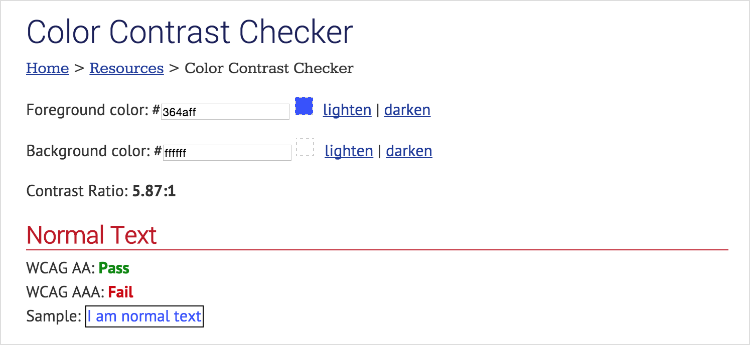
Figure 1.1
WebAIM has an online colour contrast analyzer to help you determine if the text/informative content and background you are testing meet the AA or AAA success criteria for colour contrast.
In this example, small text conforms to a AA colour contrast ratio, but does not meet the required AAA ratio. For legislative purposes, this colour contrast is accessible.
It is encouraged for websites and systems to strive for AAA where possible, but this is not (yet) a legal mandate.
Continuing with the colour contrast example, conforming to guideline 1.4.6 Contrast (Enhanced) means the website text and background colours have a contrast ratio of at least 7:1, meeting level AAA success criterion.
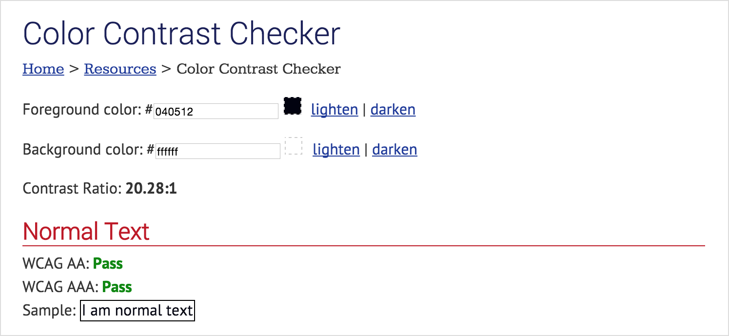
Figure 1.2
This contrast ratio is WCAG 2.0 AAA conforming for small text and large text.
Four Principles of Web Accessibility
Developed by WCAG, these design “principles provide the foundation for web and digital accessibility” (WCAG 2.0, 2015). The four principles serve to organize the Guidelines and Success Criteria into four conceptual pillars of digital accessibility.
Perceivable
Web-based content and interface components must be presented in ways that all users can perceive, regardless of individual impairment.
Example: in conformance with WCAG 2.0 guideline 1.1, a website must provide text alternatives for all image based content.
Operable
All users accessing a website or application, regardless of their preferred usage method (mouse, keyboard, voice recognition, switches or input device) must be able to simply and accurately manipulate the interface and navigation components.
Example: in conformance with WCAG 2.0 guideline 2.1 all website functionality must be available via the keyboard.
Understandable
Content and interfaces are as clear as possible so that all people understand the website.
Example: in conformance with WCAG 2.0 guideline 3.3, the website must be equipped to help users avoid and correct mistakes (e.g. form input, navigation).
Robust
Ensure web content can be interpreted reliably by the widest variety of browsers, devices, and assistive technologies.
Example: in conformance with WCAG 2.0 guideline 4.1, the website must be compatible with current and future browsers, applications, and ATs, to the fullest extent possible.
Design Considerations
Luminance Contrast Ratio
A measure of the contrast difference between foreground (e.g. text) and background colours; WCAG 2.0 recommends specific minimum ratios.
Captions
Synchronized visual and/or text alternatives for speech and non-speech audio information needed to understand media content such as television programming, web video, or movies.
Clickability Cue
“A visual indication that a given word or item on a Web page is clickable. Cues that can be used to indicate the clickability of an item include colour, underlining, bullets, and arrows.” (Usability.gov, Accessibility Glossary Terms)
In usability terms, this is very similar to affordance.
Visual Focus
Where the user’s focus is on a Web page; generally represented by a dashed box that appears around items on the page and associated with keyboard tabbing. This focus could be customized during the design of the site and override the default browser focus appearance – all it takes is applying the hover style in the CSS to the focus pseudoclass and applying the focus pseudoclass to elements on the page that receive visual focus.
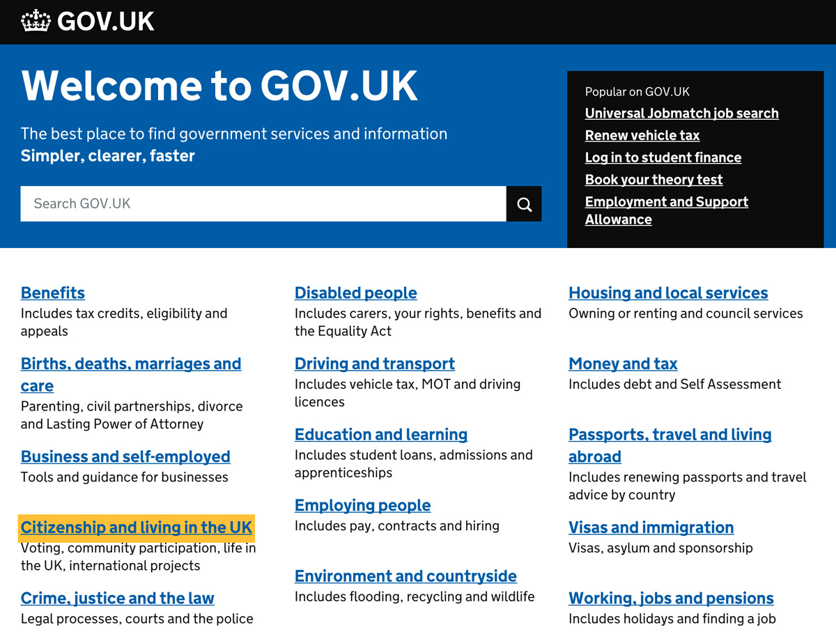
Figure 1.3
Gov.uk uses a consistent yellow highlight to indicate visual focus to users that might be using a keyboard to navigate the site.
Type Legibility
The specific traits of a font (shape, scale, style) affecting recognition of letters and words.
Type Readability
The clarity and speed with which content can be digested over an expanse of text. It can be affected by length of a line of text, text spacing, and alignment on the page.
Internationalization
Designing a system to work in multiple languages and in the cultural contexts of different locales.
Development Considerations
Programmatic Focus
Where the computer’s focus is on a web page. It should be congruent with visual focus (see below) and should provide appropriate cues to the user through any assistive technology being used.
Graceful Degradation
The essential content on a website is not affected by non-enabled browser features or new technology.
Semantic HTML
Using HyperText Markup Language to reinforce the meaning of the information within the webpage rather than merely defining the presentation or look of it.
Example: using a numbered list tag to enclose a set of items that differ in importance.
Content Considerations
Alternative Text
Brief text (125 characters or less) used to describe images. Text alternatives for images and non-text content should accurately reflect the purpose and intent of the non-text content.
Long Descriptions
Descriptions that are written for complex figures and tagged via the “long desc” HTML attribute.
Transcript
A text version of the speech in a movie, web video, or television program. They are not provided in real time and are not a recommended substitute for captions.
Assistive Technologies
Screen Reader
A software program that turns written content and navigation into speech or Braille output. Used primarily by people with visual impairments. Examples include JAWS and NVDA.
Audio Browser
Web browser that provides a text-to-speech capability for blind or visually impaired people.
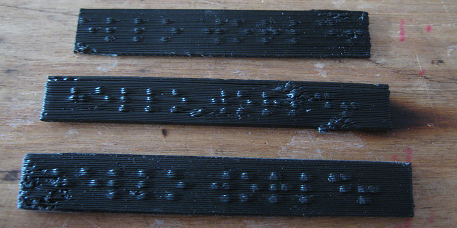
Braille Display
Device that converts screen content to braille by raising bumps through a dot matrix on a flat surface.

Accelerator Keys
Combinations of keyboard keys (shortcuts) that allow a user to make software commands instead of interacting with menu options or different parts of a user interface.
Resources Cited
- AODA Official Website
- Usability.gov's accessibility glossary
- [PRINT] RGD Access Ability – A practical handbook on accessible graphic design
- W3C WCAG 2.0 Guidelines
- Story, M.F. (1998). Maximizing Usability: The Principles of Universal Design. Assistive Technology, 10:1, 4-12.