Tools to Help You Design and Develop Accessible Experiences
How do we ensure that new products, services, and re-designs are designed accessibly from the start?
In this article I'll cover some tools that can help UX designers and graphic designers create accessible digital experiences from the very beginning of the product life cycle.
Provide Alternatives for Non-Text Media
Catalogue all image, icon, diagram, multimedia, and miscellaneous non-text assets in a database. Associate appropriate alternative text with static non-text content (such as images or diagrams). This text can be informative or null, depending on the meaning of the asset. Associate captions, audio descriptions, or media alternatives (e.g. transcripts) for pre-recorded time based multimedia.
Consider forking the non-text content into “decorative” and “informative” databases. If you’ve got all your content ready to go at the start of your design phase, you can use a spreadsheet or image cataloguing software. If you’re getting the images and assets in tandem with design and development, consider cataloguing all the assets and alt text directly in your CMS.
Staying organized in this way will not only help you keep track of a large array of non-text content, it might actually help you step back and cull some of the decorative or non-essential elements scattered throughout your project. Is that icon really necessary? Is that picture really more useful than the text that follows? Asking these kinds of strategic questions before starting development will cut costs, benefit the business, and benefit every single one of your users.
Tools to Catalogue Content
Tools to Caption Time-Based Media
Tools to Transcribe Time-Based Content
Linearize Content
During design, make sure that a linear reading of your page content makes sense, and flows logically according to western (top left to bottom right) convention or the reading convention where you are located.
Use headings in a meaningful, hierarchical way.
Make note of sections of the page that will be dynamic, or that will change with user input and ensure the user will be aware of these changes as they navigate the page linearly.
Make note of elements that cannot be easily linearized such as nested navigation trees or data tables. Document alternative text, keyboard functionality, and HTML mark-up that will improve linear readings or exploration of non-linear elements via keyboard, screen reader, or assistive technologies.
Once the page is in development, use a keyboard and screen reader to check the tabbing order and the reading sequence of the page.
Most Popular Screen Readers for Desktop
Most Popular Screen Readers for Mobile
Manual Code Inspection Tools
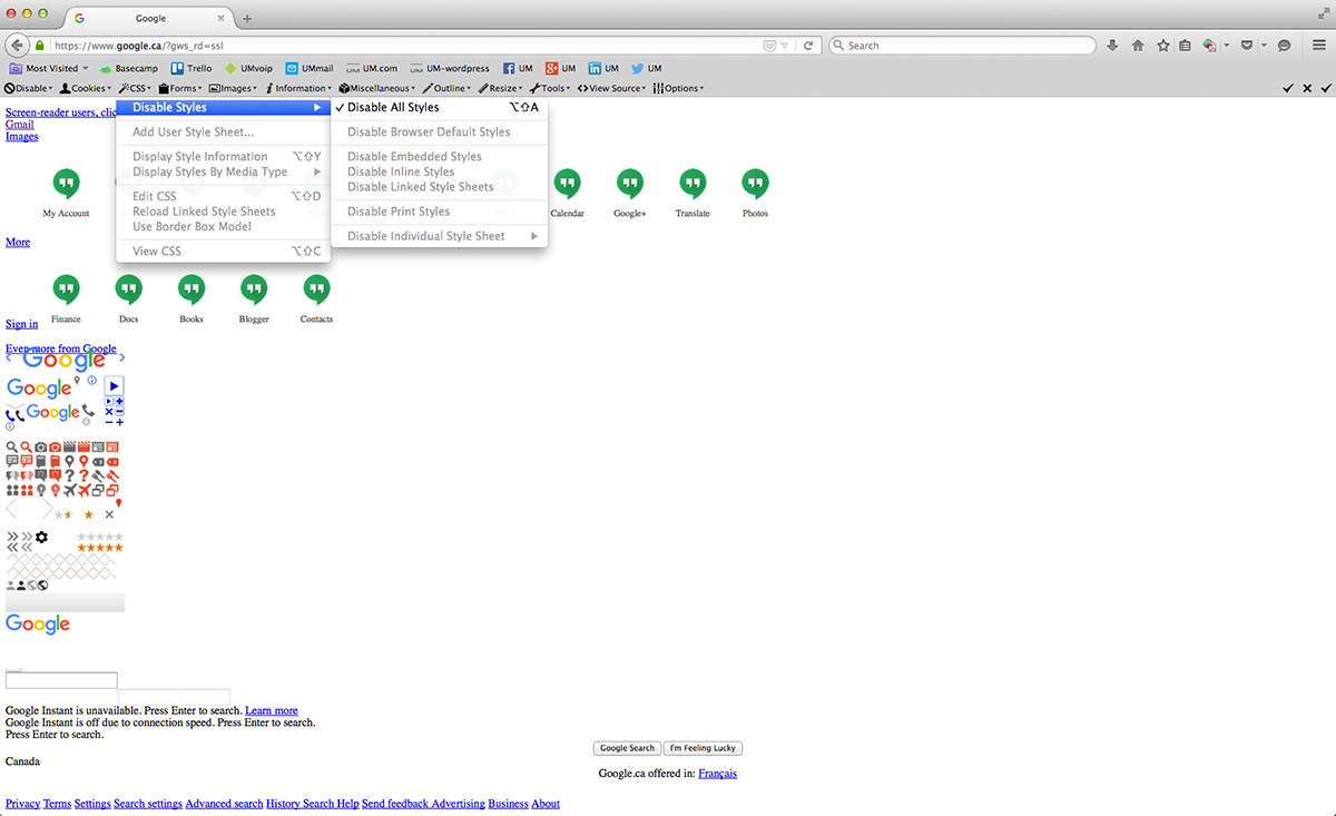
Use a tool that disables the CSS of a live page, effectively linearizing any styled layouts.

Figure 1.1
Firefox Web Developer Extension used to remove all CSS styles on Google.ca. You'll notice the page depends heavily on CSS and the page hierarchy is thrown off considerably when the CSS is deactivated. If a website is structured accessibly, disabling the CSS would not affect the information hierarchy nor impede the user from understanding the contents of the page.
Provide Optimal Colour Contrast
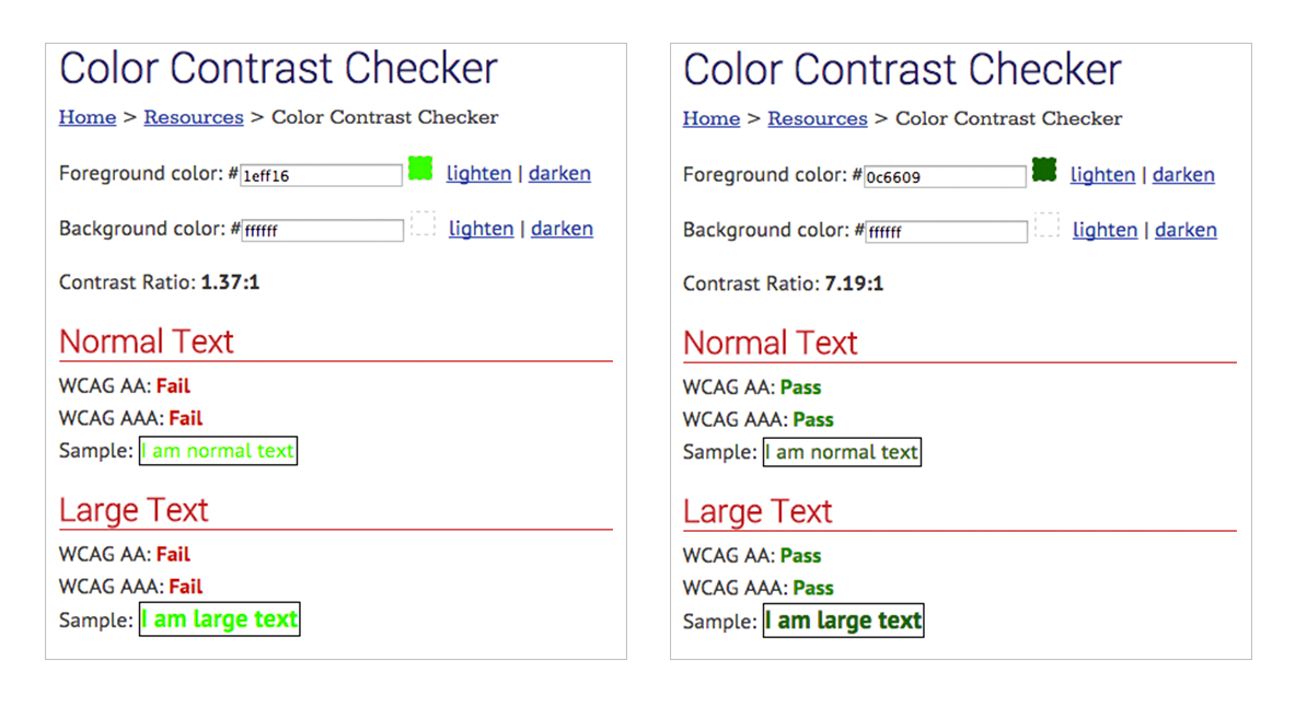
When creating a colour palette or when using an existing branding colour scheme for a client, ensure that colours of foreground and background (for informative text and diagrams) have optimal contrast.
My favourite colour contrast analyzers:

Figure 1.2
Web AIM Color Contrast Checker. Failed color combination on the left. Alternative accessible color combination on the right.
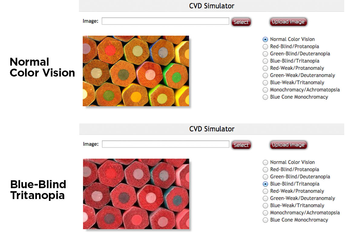
Additionally, consider running your colour palette or designs through colour blindness filters to see how people with various visual impairments will perceive your work.
Colour blindness simulation tools:

Figure 1.3
Demo of results using the Coblis colour blindness simulator tool.
Ensure Your Code is Semantic
Make sure your content works predictably and reliably in different browsers, on different devices, and for assistive technologies.
Once the product is in development, it’s important to go through several cycles of accessibility quality assurance using manual and automated code checks to ensure the code is conformant to the WCAG 2.0 guidelines, oftentimes improving conformance to HTML5 standards along the way.
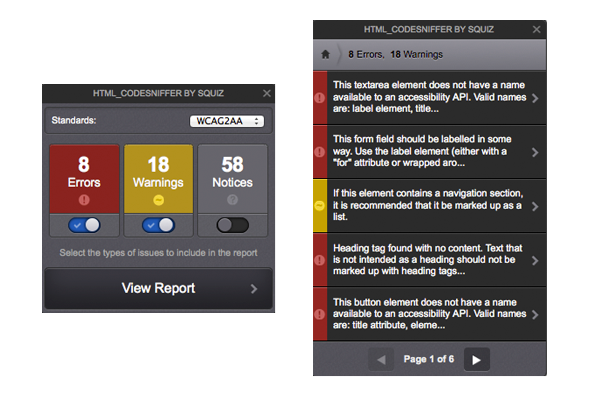
It’s important to note that automated code checks are only as useful as the auditor is knowledgeable. False positives are common while more conceptual or important issues (e.g. keyboard accessibility) can be completely ignored. For example, an automated check does not discern easily between an informative image and a decorative image, so it is unable to recommend if an image missing an alt attribute requires a null or informative text string. The greatest advantage of automated code checking is being able to expediently tell if the code has semantic or parsing errors, or if specific types of components (e.g. tables) are missing certain labels.
Automated Code Checkers

Figure 1.4
Codesniffer in-browser application/bookmarklet.
Highlight
Leveraging a set of tools will not guarantee an accessible or even a usable product. To create truly accessible experiences, designers have to adopt an inclusive design mindset and carefully consider how the product will be used by everyone in their user group, regardless of natural human variation. A great way to do this is to co-create with the people that will use the product or service, especially the people that fall outside the normative bounds of generalized personas.
This means taking into account human variation with every design decision and consistently providing this rationale to stakeholders in order to improve understanding and implementation of accessible design. It also means testing designs or prototypes early and often, not only with your target demographic, but also with persons with disabilities so you can be confident that your product works for real people.
