Designing a Rich Mobile Experience for an Online Holocaust Survivor Memoirs Resource
Project Summary
Client
The Azrieli Foundation is a Canadian philanthropic organization that provides funding, operations, and partnership to a large number of initiatives in various fields. Their scope includes scientific and medical research, education, Jewish community, Holocaust commemoration and many more.
In 2015, the Holocaust Survivors Memoir team partnered with Usability Matters and Riddle Films to ideate, design, and develop a desktop/tablet-only immersive interactive documentary experience called Re:Collection. This digital experience houses autobiographical video, written, and photographic content collected from Jewish folks that survived WWII and made a home in Canada.
Core Design Team
- Shannah Segal Design Director
- Adie Margineanu UX & Visual Designer
- Simon Coyle Art Director
Activities
- Requirements Gathering
- Usability Testing
- Wireframing
- Prototyping
- Visual Design
01
Project-Specific Goals
In 2017, we were re-engaged by the Azrieli Foundation to design a mobile experience for Re:Collection, taking into account the heavy mobile use of their primary target audience - high school students.
Our client wanted a robust and well performing mobile experience that kept the spirit, organizational paradigm, and visual design of the large screen experience intact.
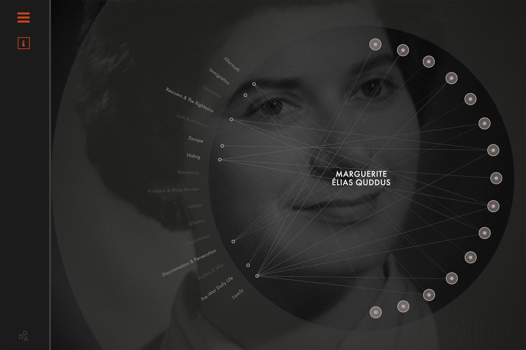
Figure 1.1
Original large screen experience and art direction by Simon Coyle.
02
Understanding the Problem Space
In order to inform and validate the design direction for a mobile version of Re:Collection, we conducted a short requirements gathering session with the client and development team to ascertain whether we were designing a native application, a mobile website, or a responsive breakpoint.
We concluded that the design direction would influence the development approach while realizing that a mobile website would be most cost effective, practical, and easy to disseminate on a wide range of mobile devices.
03
The Design Process
We began with several design tenets to guide the design process:
- AKeep the spirit, organization, and look and feel of the large screen Re:Collection experience intact.
- BMake the mobile experience more accessible - especially the colour contrast - to account for changing light conditions.
- CKeep it simple and as consistent as possible across different screens to decrease loading time and improve navigation for users.
- DProvide labels for all interactive elements and iconography.
First I sketched design solutions on paper. Because we knew we wanted to test the design artefact at some point, the sketches were turned into a lo-fi prototype using Axure - this was also used to present design progress to the client before spending time and effort on Photoshop mockups. Several flows that we needed to test to meet our research objectives were prototyped with higher interaction fidelity in Axure.
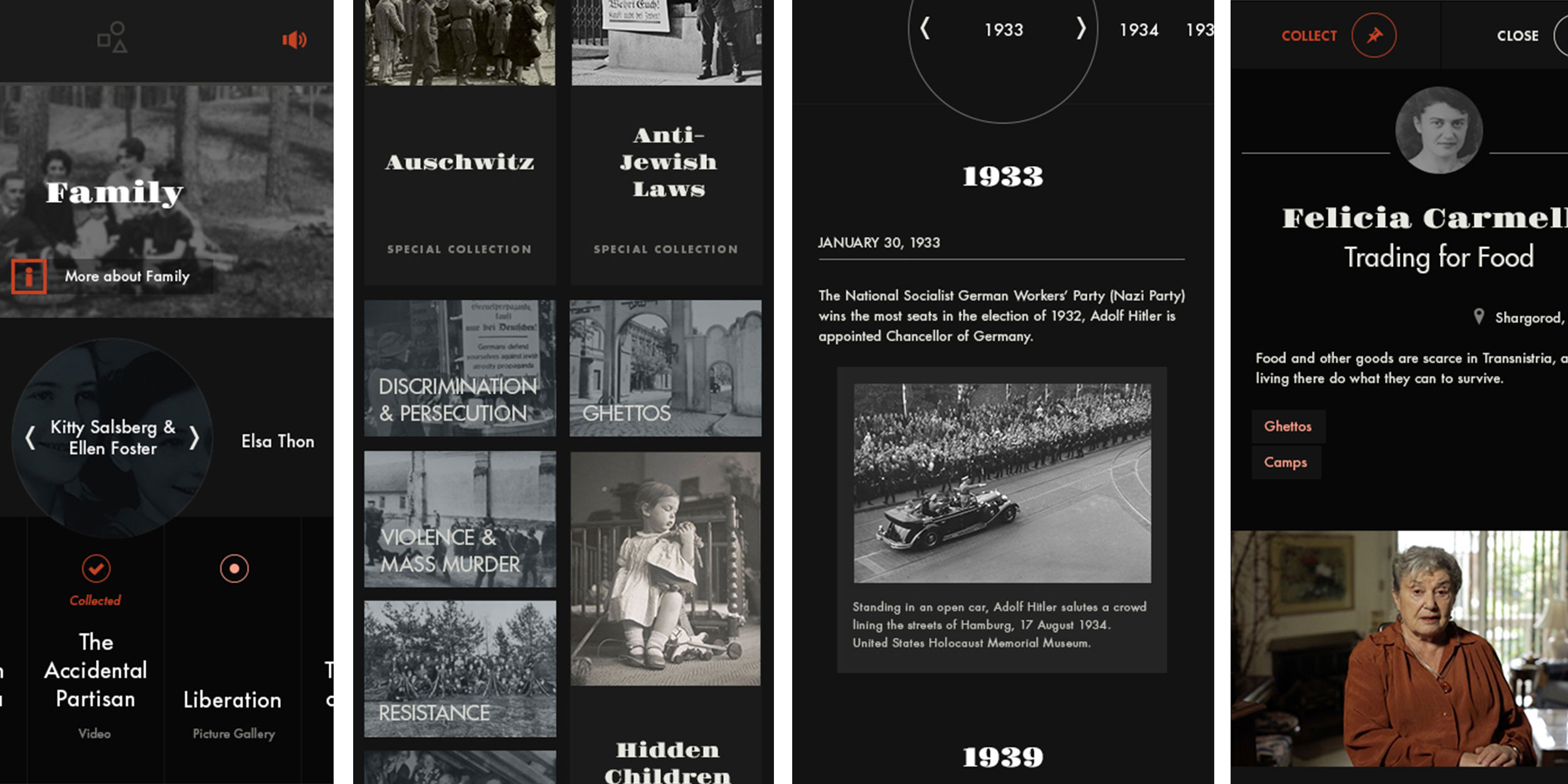
One of the design challenges with this project was turning the interactive wheel Simon designed for survivor memoirs navigation (Figure 1.1) into a mobile-friendly experience. Below you will see some iterations of the design paradigm I used, along with final visual designs. This section of the prototype tested very well and we did not need to make revisions.
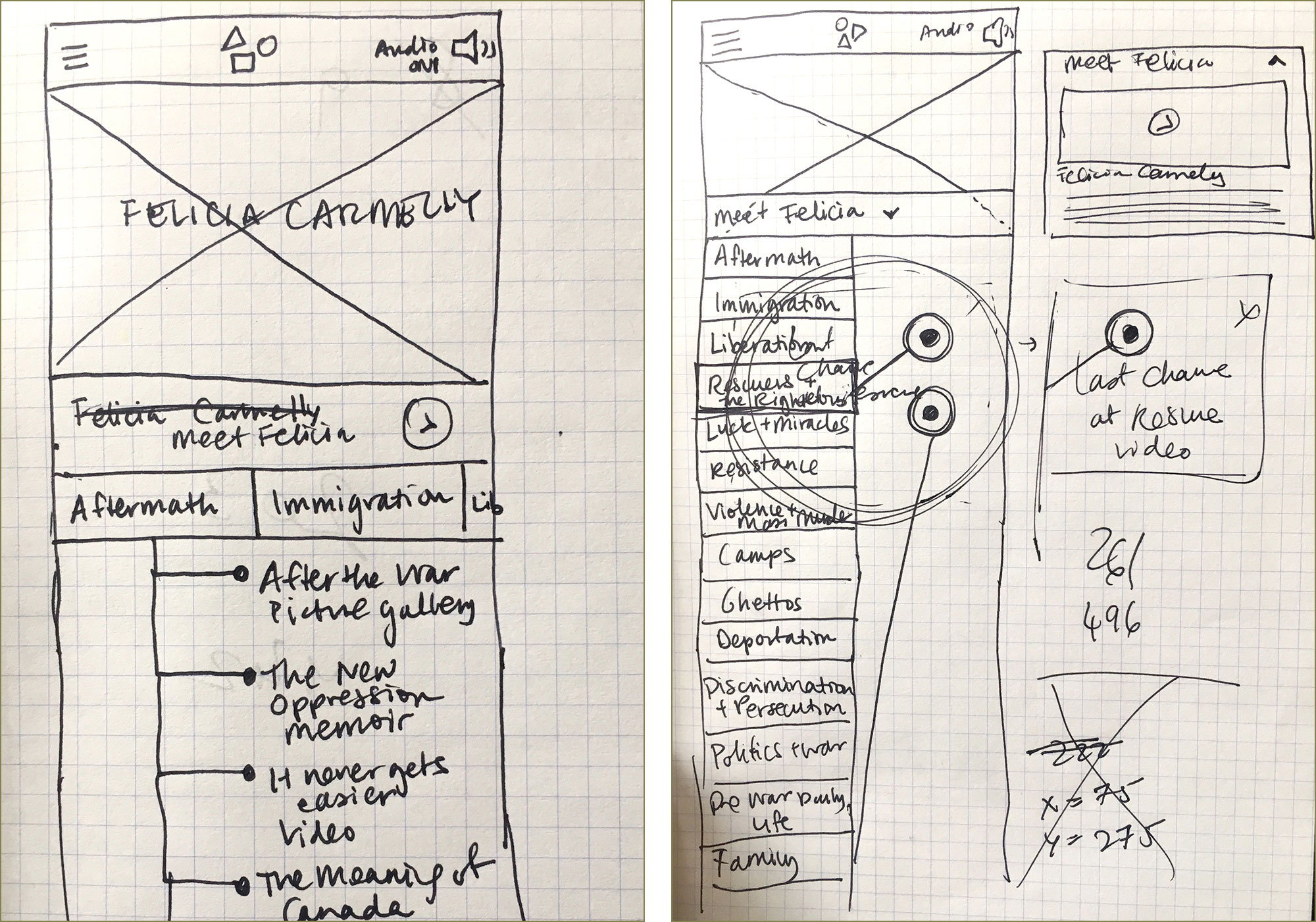
Figure 3.1
Initial sketches for the Survivor landing page attempting to keep some of the wheel functionality intact and organizing the assets by theme.
Upon showing these to the client, they wanted assets only tagged by theme and organized chronologically.
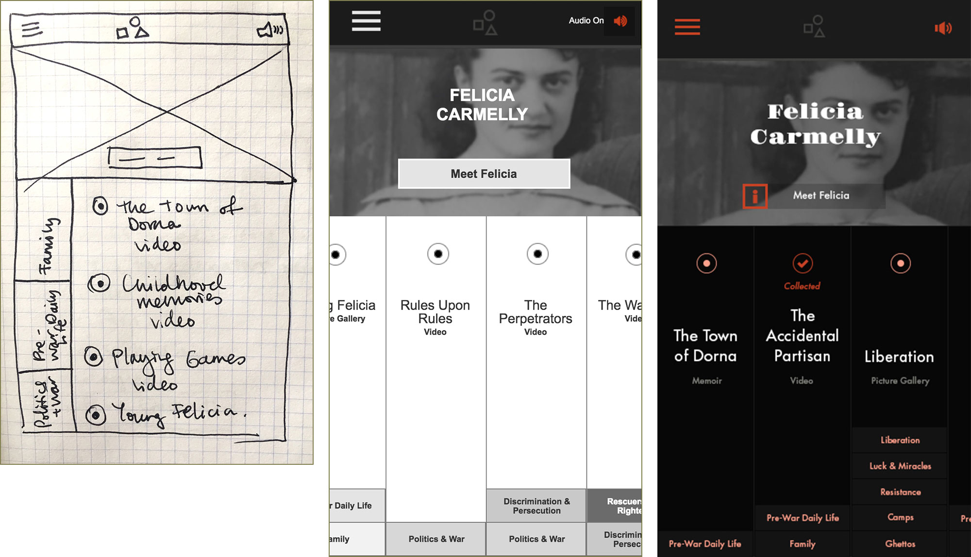
Figure 3.2
The final variation the client preferred had all the survivor’s experiences in columns arranged chronologically, that could be scrolled through horizontally with all relevant themes as tags stacking up from the bottom of the column.
The sketches were turned into interactive wireframes to present to the client in Axure (middle) and that was polished into a visual design using Photoshop (right).
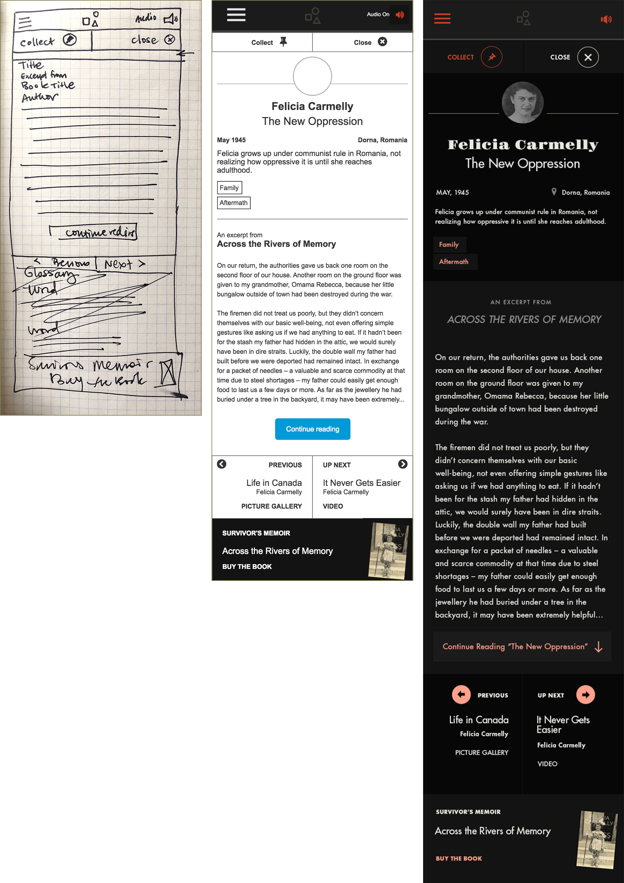
Figure 3.3
The progression from sketch to final mockup of a survivor memoir asset. Several changes were made from the large screen experience that we suggested “trickling back” to the large screen such as surfacing the previous and next buttons, the option to buy the book, and the meta information about this asset (such as the themes and synopsis). The client team was supportive of adopting these changes across screen sizes.
04
Evaluative Research and Design Iteration
We wanted to ensure the proposed design worked for high school students that may potentially use this resource in their school work, so we decided to do some rapid testing and iterate according to the testing insights toward the end of the project. To be as cost efficient as possible, we tested using the Axure prototype rather than waiting for production-ready code from the development team.
High school students (at least the ones we recruited) seem to have a high degree of tech literacy. We asked them to find different areas of the website, to add assets to their collection, to interact with a historical map, and to browse assets by survivor and theme.
We uncovered some minor issues that we iterated on before handing over the prototype and mockups for development.
Evaluative Research Insights
Page Hierarchy and Organization on the Home Page
Students thought that the smaller pieces of content belonged to the full width pieces of content. We modified the design to have all page elements the same width and eliminate this confusion.
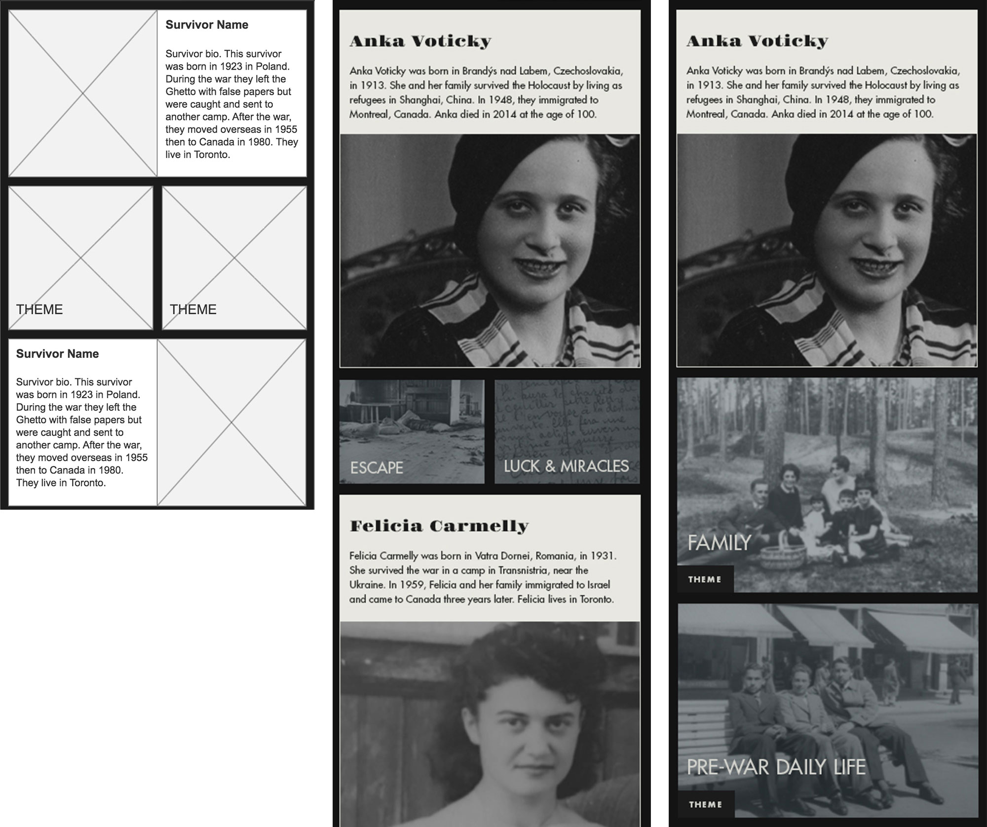
Figure 4.1
Original design that we tested (left and middle) and final design with full width modules and improved labeling for themes.
Nomenclature and Interaction Paradigm Issues in the Menu
Some students had difficulty figuring out what the Explore and Historical Timeline menu items were about, especially with the hidden second level of navigation for the Explore section.
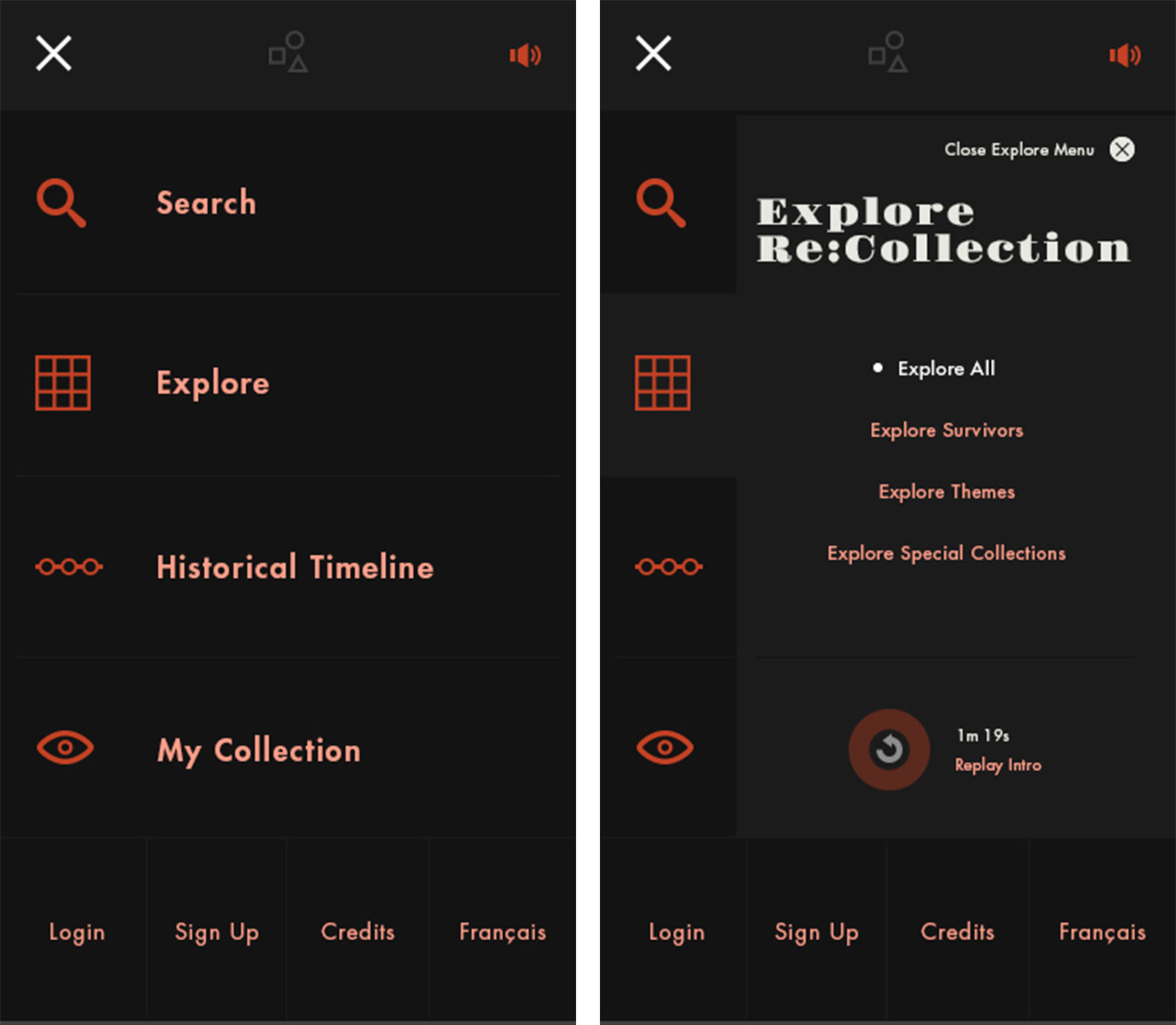
Figure 4.2
Initial navigation nomenclature and two click exploratory paradigm for Explore section.
We changed them to be more specific and we surfaced more content under the top level of navigation rather than burying it two levels deep.
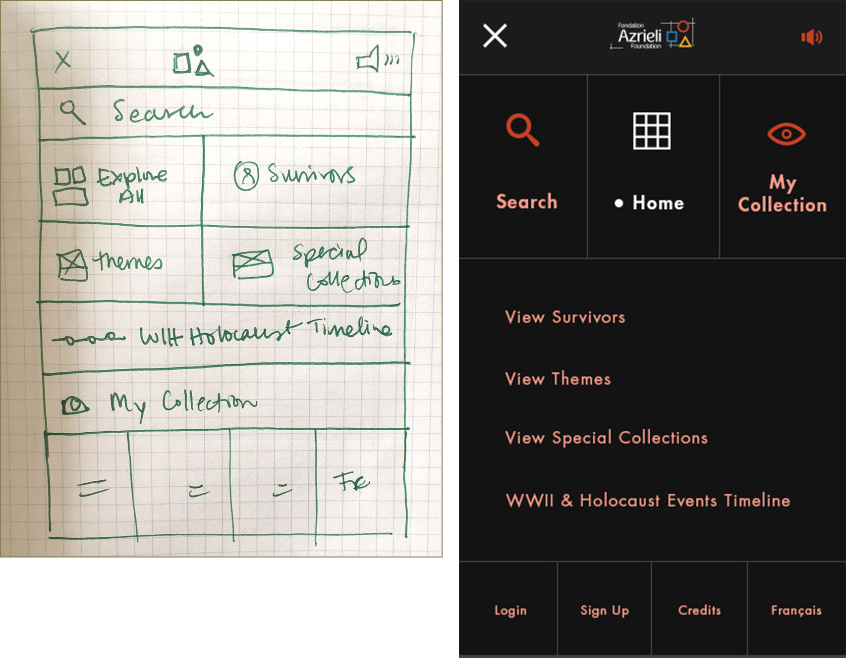
Figure 4.3
Sketches and final mockup of the revised navigation, surfacing all content, providing more exact labels, and taking users directly to a page rather than bringing up a level of hidden navigation in the Explore section.
05
Learnings
- ARecognize your assumptions and do your best to validate them with people when you're designing a brand new product.
The large screen Re:Collection experience was designed thoughtfully and with care, so creating a mobile-specific experience after the fact, was not very difficult. However, ensuring you’re designing for the right medium from the very beginning can have significant impact on cost, quality and consistency of the experience, development effort, and any evaluative research insights since it can be tested simultaneously on the range of intended mediums.
- BIf your target demographic is a younger generation, be prepared for a high degree of tech literacy.
This does not mean the product can be complicated, unusable, or inaccessible. It just means that there is higher tolerance and appetite for thoughtful innovation and probably overall, a greater success rate during testing.
- CAlways put your work in front of representative users.
Even with a pretty tech literate group, there were important insights about visual page hierarchy, navigation and nomenclature issues we would not have uncovered otherwise.
06
Impact
The Azrieli foundation will be able to easily demonstrate the value and importance of this collection of memoirs on any device.
The mobile experience will be available for students and teachers to learn and teach from, across Canada.
The mobile experience is currently under development. To explore the large screen experience, visit the Re:Collection website